Last spring I took a bunch of photos on a guys weekend trip up in Bancroft, Ontario. The location was a friends family farm. While walking around I saw an interesting barn wall with nice color and texture. I snapped a photo, later on I realized that among the carving on the wall was two initials of a friend and his GF. They are now engaged so I thought the image would make a nice gift. In the process I learned a bunch about editing for print.
I didn't record any real detailed information on what I did, but will do my best.
The original image was good, but lacked any real pop, also there was some distracting carving dead center in the image that drew the eye to the wrong place. It was gonna take a bit of effort to pull it off.
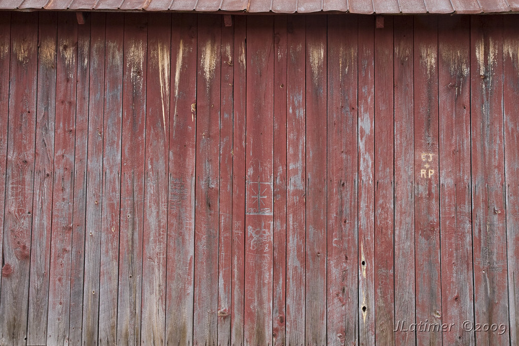
I decided to go for subtle changes as I wanted to keep things familiar and real. I started by upsizing the file to almost twice the size using Bilinear Interpolation. I didn't use bicubic as I wanted to keep the texture. Once I enlarged it, I edited the crosshair carving in the middle, just a bit of cloning to tone it down - the goal was to make it less prominent without actually removing it. The wall is familiar to many who will look at the print and if I removed it - it would be missed. Incidentally the crosshair carving was done by the father of CJ. I played with the levels a bit to bring the contrast up and make the texture pop. Again, I didn't want to go too far here. A bit of use of the clone tool was also used on the initials to make the C look less like an E.
Next came the keystoning. The goal here was to make all the boards straight and correct for the fact I was shooting up in my composition. A bit of free transform and I had that done.
Next came the crop. I used the 3 board ends that can be seen at the top to determine my horizontal crop. I maintained the right edge as it was, I wanted to move the initials as close to the third as possible as it is the ultimate subject. The final print was going to be 10x13 so my vertical crop took into account the necessary aspect ratio.
Next I resize the image to 10x13 at 240dpi, this was the right resolution based on input from my printer.
Final step... Sharpen. A bit of sharpening is applied at the end of the process. And finally... The image.

A quick trip off to the printer with my PSD file and I am really happy with the final print. It is all framed and ready for gift-wrapping.
The only mistake I made. In the future I will size the image about 1/8th of an inch larger. The printer ended up cropping a tiny little bit of the image. Not sure where that happened, but I will find out why for future efforts.
Thanks to BJ Photo in Waterloo for the quality print. BJPhoto.net
No comments:
Post a Comment